Challenge
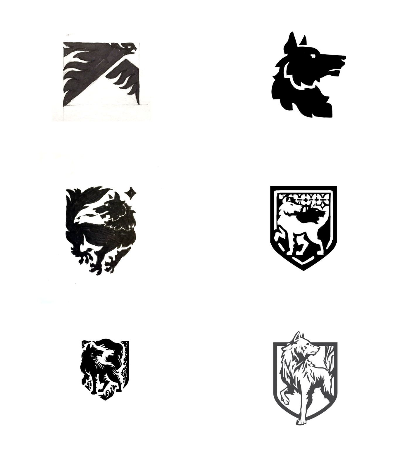
Maark was the Boston-based digital agency I worked for from 2008-2023 and back in 2018, we decided to rebrand. We needed a brand that would resonate internally and would also allow us to tell a clear story to the market. I was tasked with developing the logo mark and visual system for this new brand. Maark means ‘standard’ so we started to explore the idea of a heraldic standard that would represent the qualities of our team: loyalty, quality, and tireless persistence.

The Solution
In heraldry, the wolf holds the meaning of tireless pursuit in difficult industry. Maark was known for building digital experiences that required high levels of expertise. The wolf became an apt symbol of our team.
The Application
We wove the story of the wolf into our website, into all of our marketing collateral, and across our communications. The idea of the wolf as standard as well as the idea that we could guide our clients across difficult digital terrain both found their expression in the brand graphics we created for Maark.


Animation by Rodolfo Pauletto
Keyframes and art direction by Brian Weaver


